Pantone 2026 : Every year, the worlds of design, fashion and interior decoration hold their breath.
Pantone unveils the Colour of the Year, a shade meant to capture the spirit of the times, our collective needs and our deepest emotions.
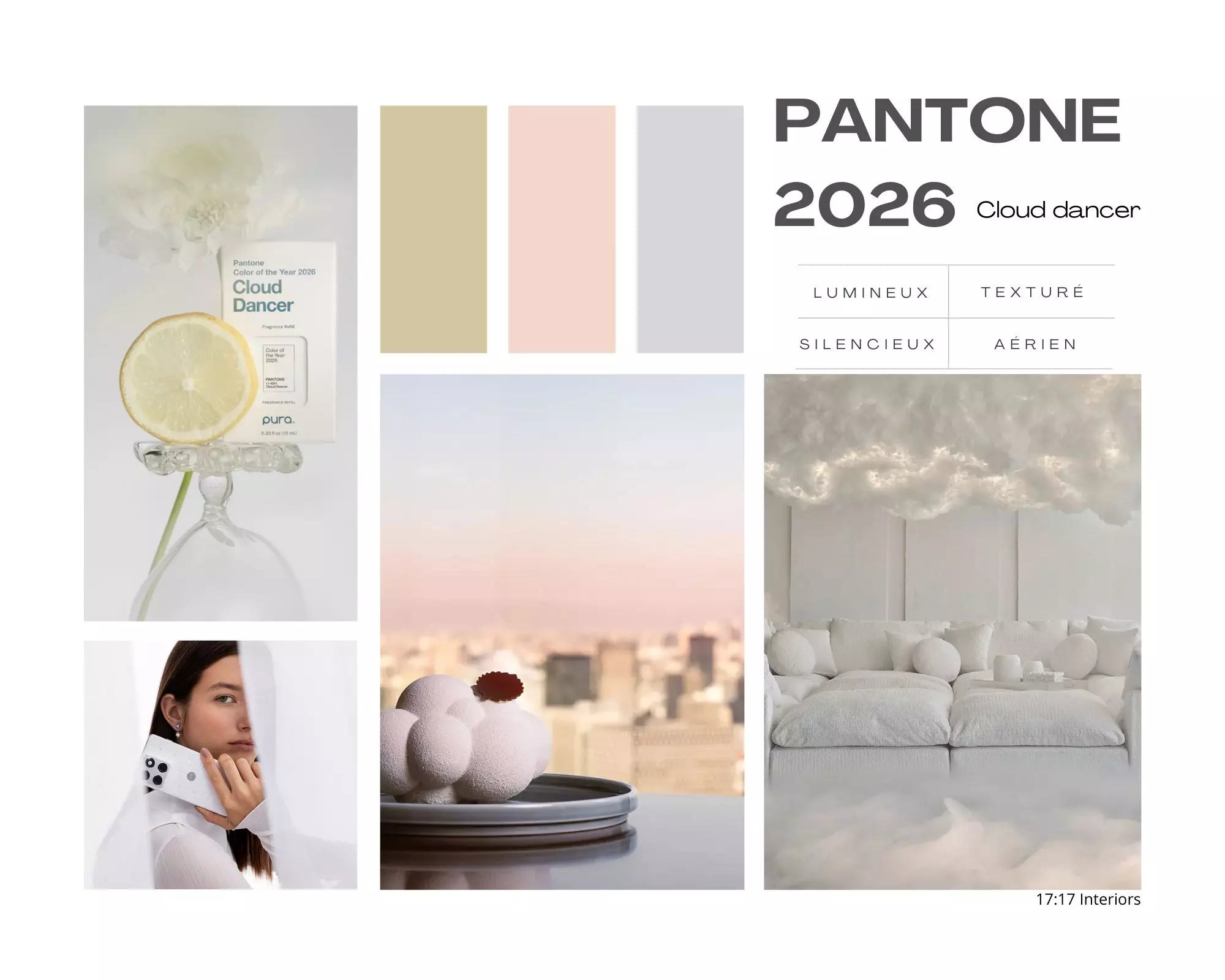
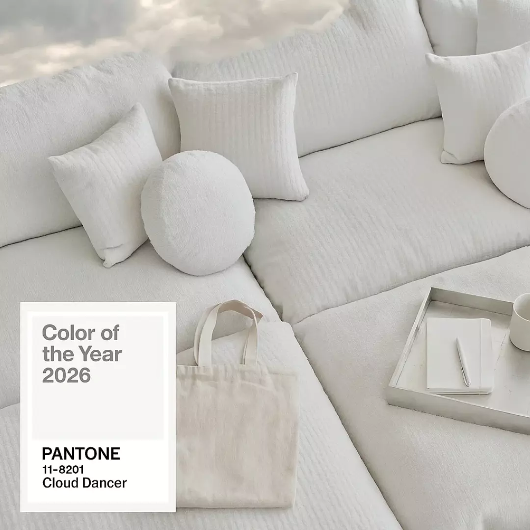
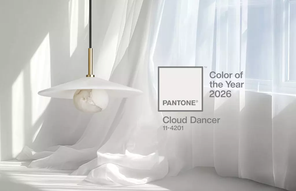
For 2026, the chosen colour is Cloud Dancer.
A nuanced white.
Airy, almost immaterial.
A colour that soothes as much as it unsettles.
But before passing judgment, let’s return to the essentials.
Pantone: what exactly is it?
Pantone is a global authority on colour.
Its mission is to create a universal language, allowing creatives, architects, designers and brands to speak the same chromatic language.
The Pantone Colour of the Year is not an imposed decorative trend.
It is a societal reading — a reflection of our era, our desire for stability, softness, or sometimes disruption.
Pantone: an influence far beyond decoration
Each year, Pantone does more than simply announce a colour.
The institute collaborates with iconic brands across a wide range of industries, transforming the Colour of the Year into tangible experiences: objects, spaces, products, and fully realised brand worlds.
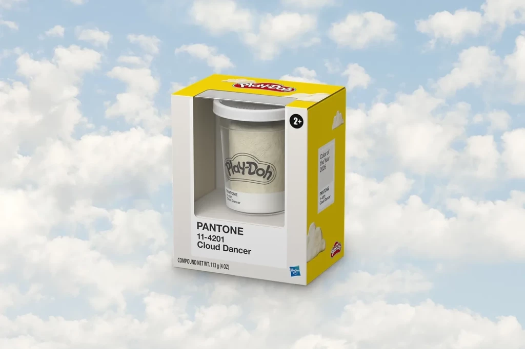
In 2026, Cloud Dancer can be seen through collaborations with Play-Doh, Mandarin Oriental, Joybird, Motorola and Post-it.
From luxury to technology, from design to hospitality, these sectors demonstrate that the Pantone Colour of the Year goes far beyond interiors, becoming part of a global lifestyle vision.
Pantone 2026: Cloud Dancer, the colour defining the year ahead?
Cloud Dancer is a subtle white, neither cold nor clinical.
A textured, enveloping white, almost cloud-like.
Pantone describes it as a colour that is:
- reassuring
- timeless
- quiet
- a refuge
In a world saturated with images, information and tension, Cloud Dancer embodies a need for breathing space, a return to what truly matters.
Why this choice… and why so much debate around Pantone 2026, Cloud Dancer?
Within the world of interior architecture and decoration, reactions are divided.
The advantages:
- a luminous and elegant base
- an ideal backdrop to highlight materials and volumes
- a return to timelessness
- an invitation to serenity
The concerns:
- a sense of déjà vu
- the fear of an “imposed” white
- a lack of risk-taking
- the uniformity of interiors
And this criticism is legitimate.
Because in interior design, colour is deeply personal.
It speaks to emotion, personal history and individual perception
At 17:17 Interiors, our belief is clear
✨ Trends should never dictate emotion.
✨ Colour should never be imposed. It should be felt.
Cloud Dancer is not an obligation.
It is a proposition.
As interior architects, our role is not to follow trends blindly, but to interpret them, adapt them, and sometimes deliberately move away from them.
A successful interior is not “on trend”.
It is right.
How to elevate Pantone 2026: Cloud Dancer (without falling into monotony)
White is never empty when it is well balanced.
Here are a few combinations we particularly love at 17:17 Interiors:
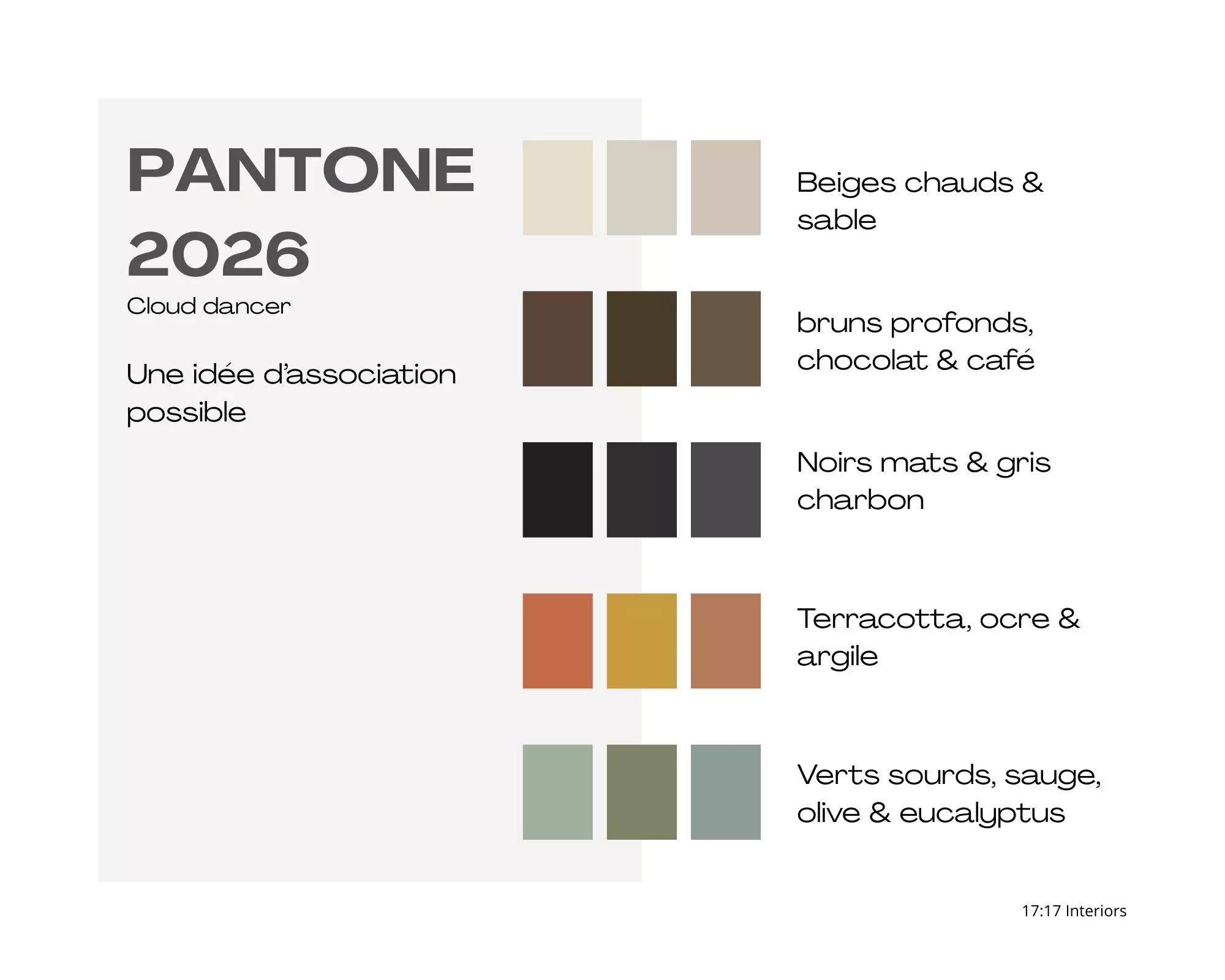
- With warm beiges and sandy tones
→ for a soft, Mediterranean, timeless atmosphere - With deep browns, chocolate or coffee shades
→ to ground the space and give it character - With muted greens (sage, olive, eucalyptus)
→ for a calming, elegant connection to nature - With matte blacks or charcoal greys
→ to create strong architectural contrast - With touches of terracotta, ochre or clay
→ to warm and humanise the space
And above all:
✨ through the play of materials: raw wood, natural stone, linen, lime plaster, travertine, patinated metal.
Cloud Dancer reminds us of one essential truth:
✨ freedom in interior design is fundamental.
The Colour of the Year is not a rule.
It is one source of inspiration among many.
At 17:17 Interiors, we believe in interiors designed to last, felt before they are seen, and deeply faithful to those who live in them.
✨ Because true luxury is daring to be yourself. ✨